Nobody books a caterer politely
Wedding catering is chosen with the eyes and the stomach, usually by a couple who have just read four identical websites full of words like bespoke and seasonal.
Salt and Fig had a genuine difference to sell: they cook everything on site rather than reheating trays from a unit forty miles away. That deserved a site with a pulse rather than another cream and serif brochure.
What we did instead
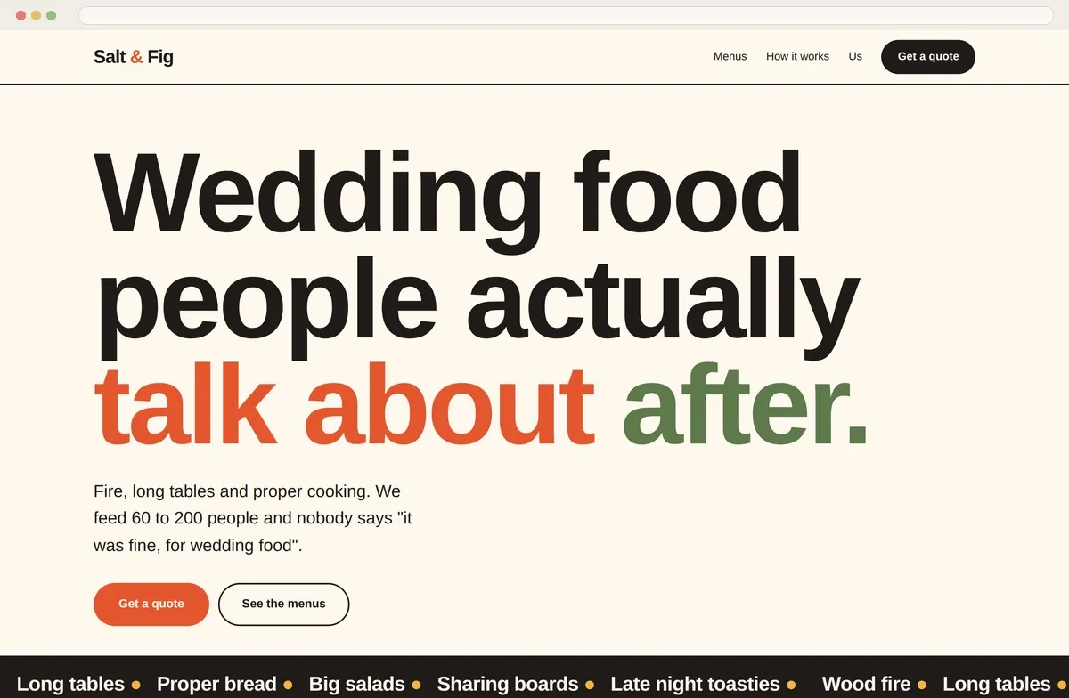
Big display type, tomato and olive and mustard, and a headline that says what the food does rather than what it is. Menus as three cards with real starting prices, so a couple can self-qualify in ten seconds.
A scrolling ribbon of what they actually cook, and a four step 'how it works' that answers the anxiety underneath every catering enquiry: what happens, and when will you tell me the price.
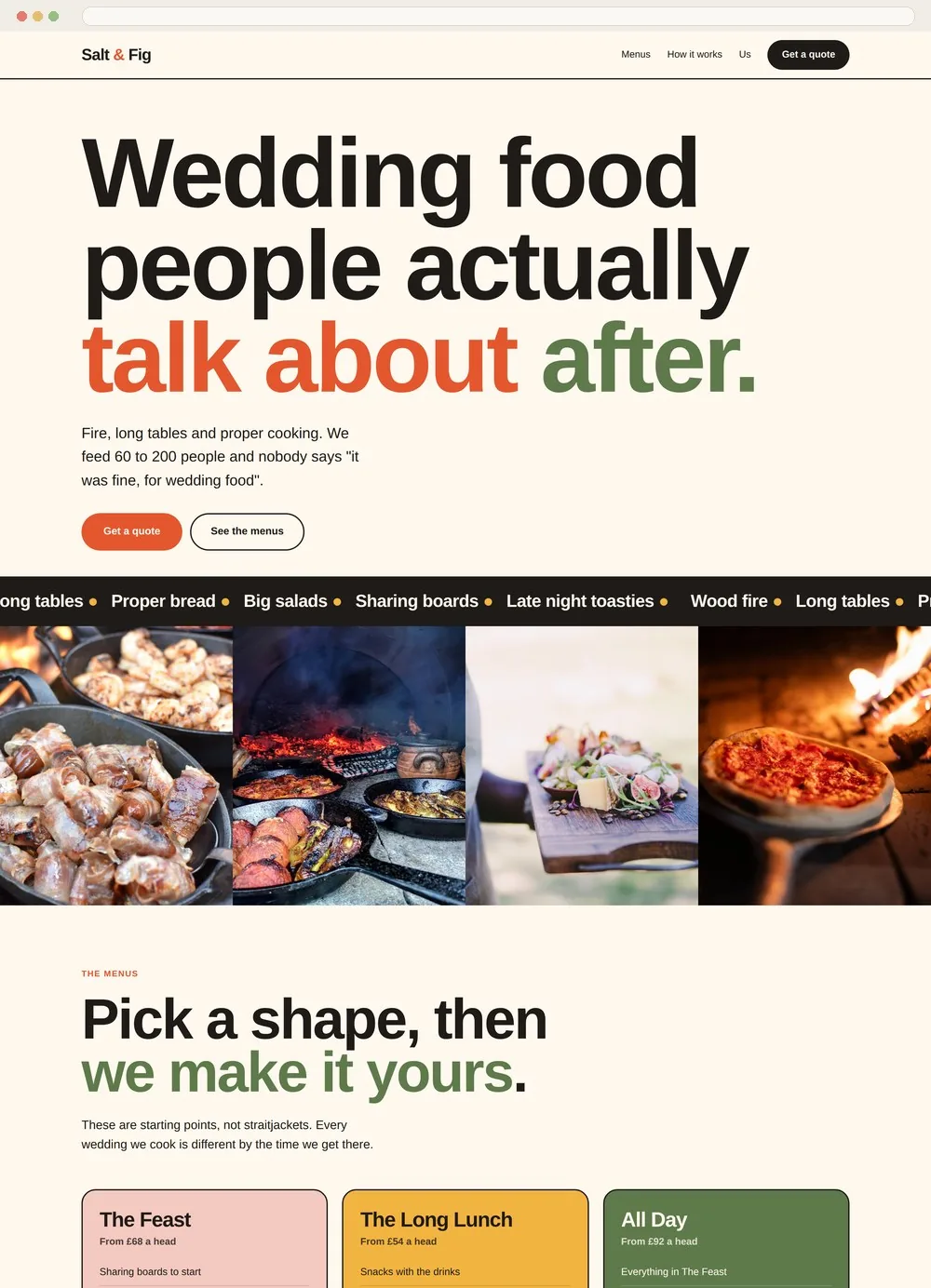
Three menus with honest starting points. Couples who cannot afford it leave, which is a favour to everyone, and the ones who stay arrive ready.
The copy sounds like the chefs. Nobody says bespoke. One line promises three guests will ask for the recipe.
Food photography at full width immediately after the headline, before a single paragraph of explanation.
Four steps ending in 'we turn up and cook'. It quietly answers the fear that catering will be complicated.
Tomato, olive and mustard on cream. Instantly recognisable next to a shortlist of cream and serif competitors.
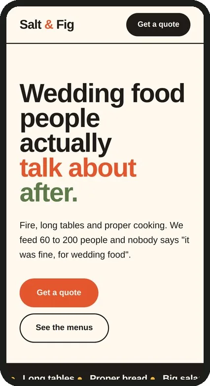
Heavy on personality, light in weight, with an enquiry form that asks only what is needed to price the job.
Shall we design one for you?
If this is the way you would like your work presented, we would love to hear from you.
EnquireView the Salt & Fig site in full
A site like this is designed, built, hosted and cared for under one monthly commission, with search and AI visibility work alongside. What a commission includes